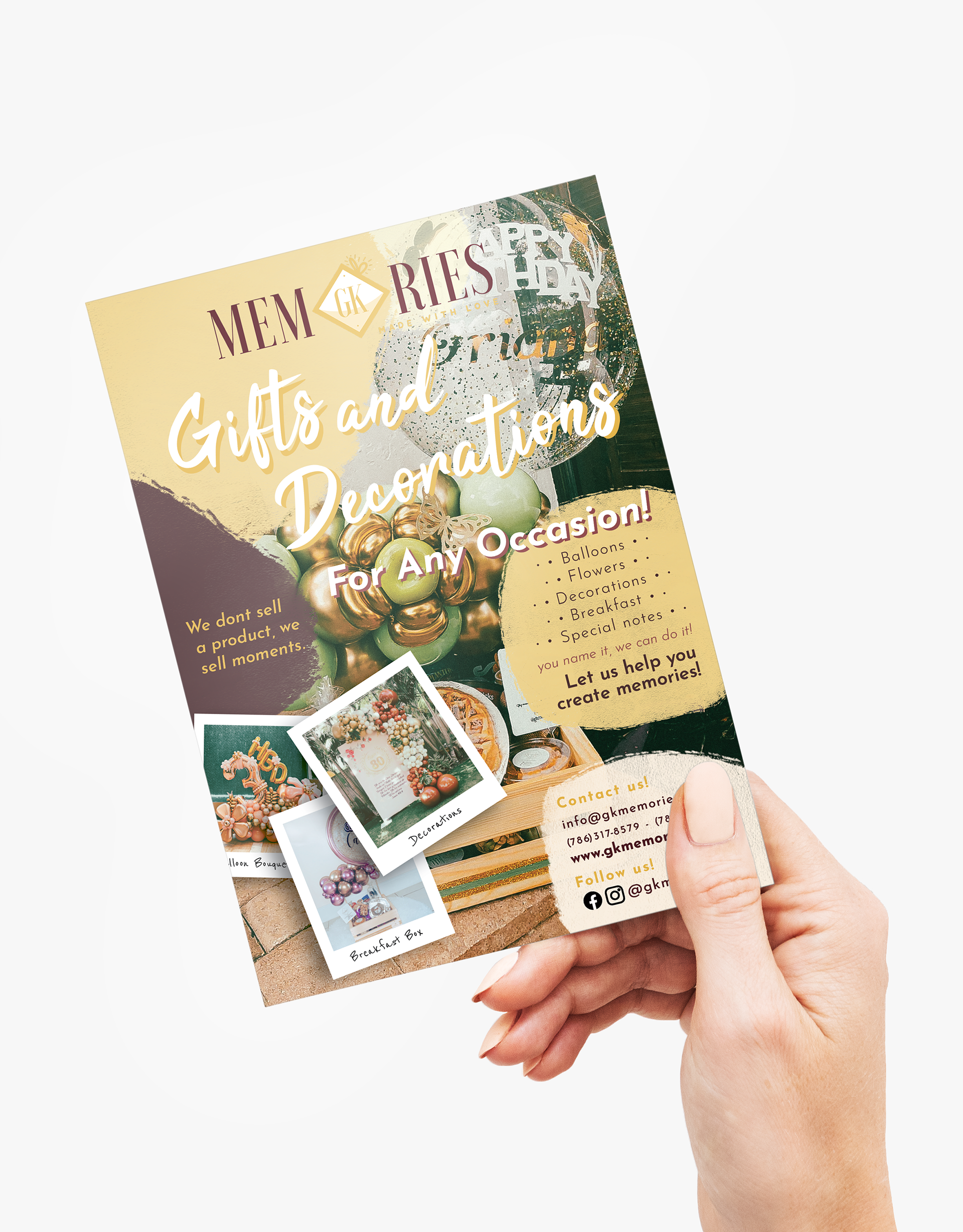

A logo redesign for a small business called GK Memories Inc.
I was also hired to design flyers and a Banner for them!

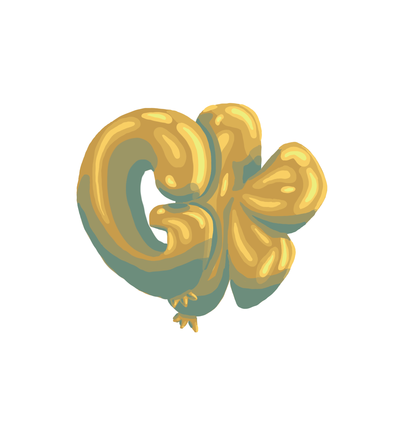
The original logo for this small business was created by them.
GK for the owner's initials and Memories for the focus of their product, and even a slogan.
The client left the creative aspect of the logo up to me, although, she wanted gold to still be a color used. I thought up what her small business does, what she offers, the initials, and the slogan all together, to come up with something meaningful, fun, that she would like, and would stand out!

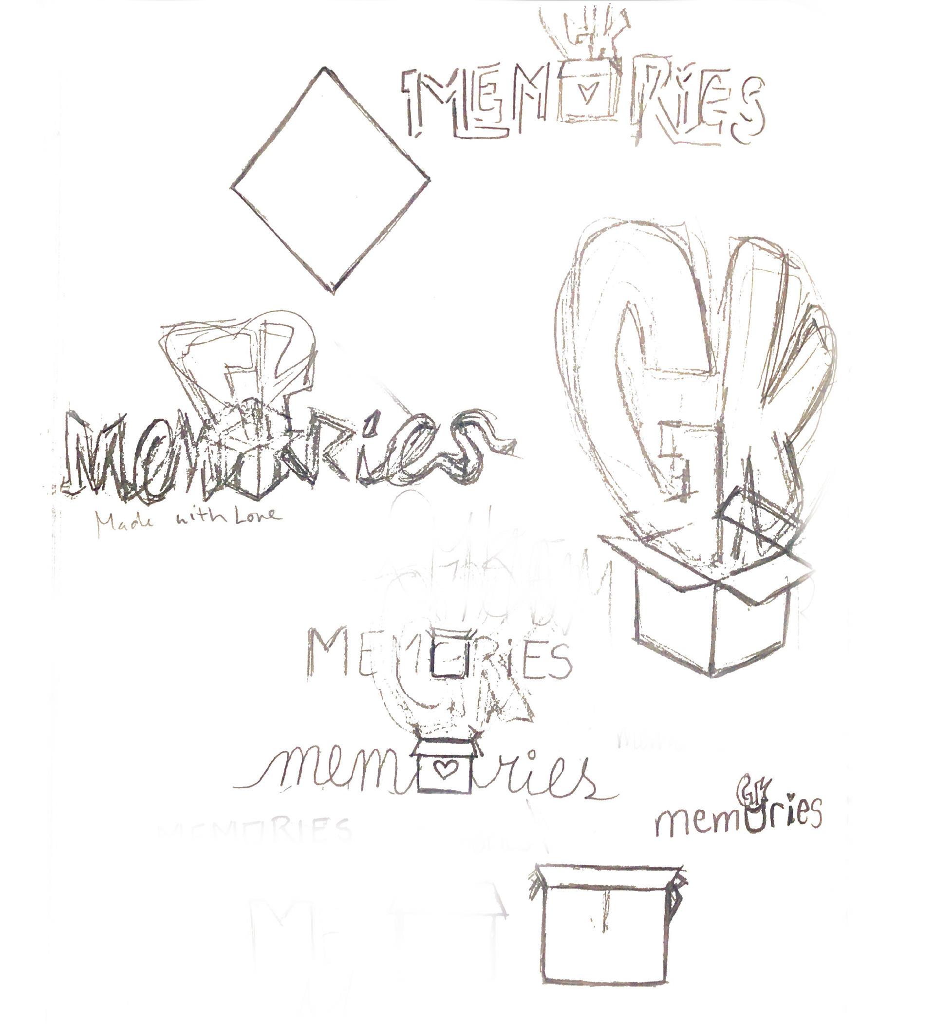
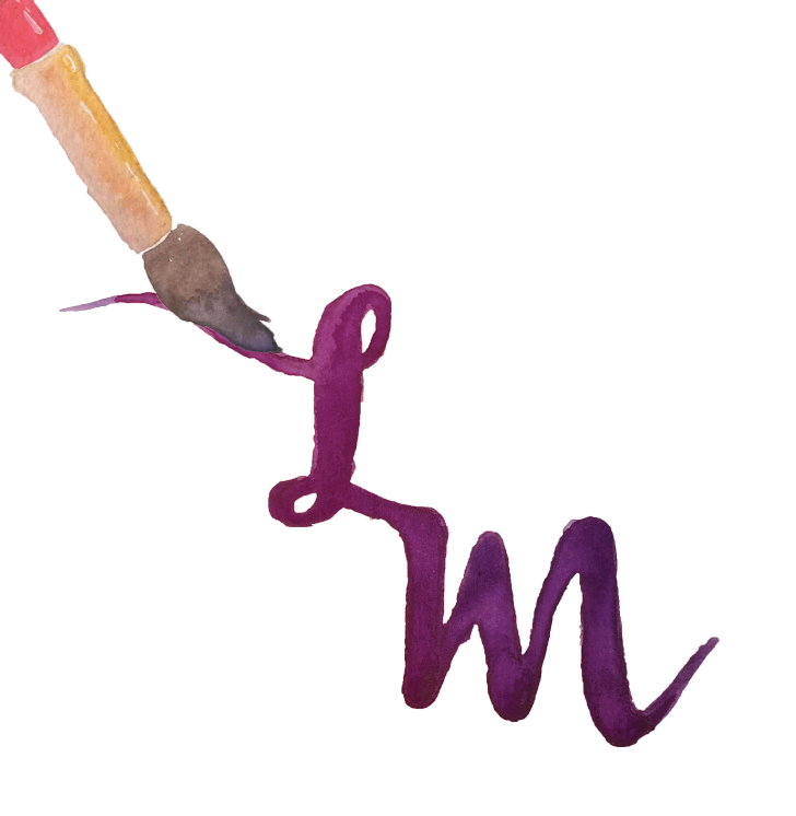
I then took some of these sketches to my Ipad to further expand on it.


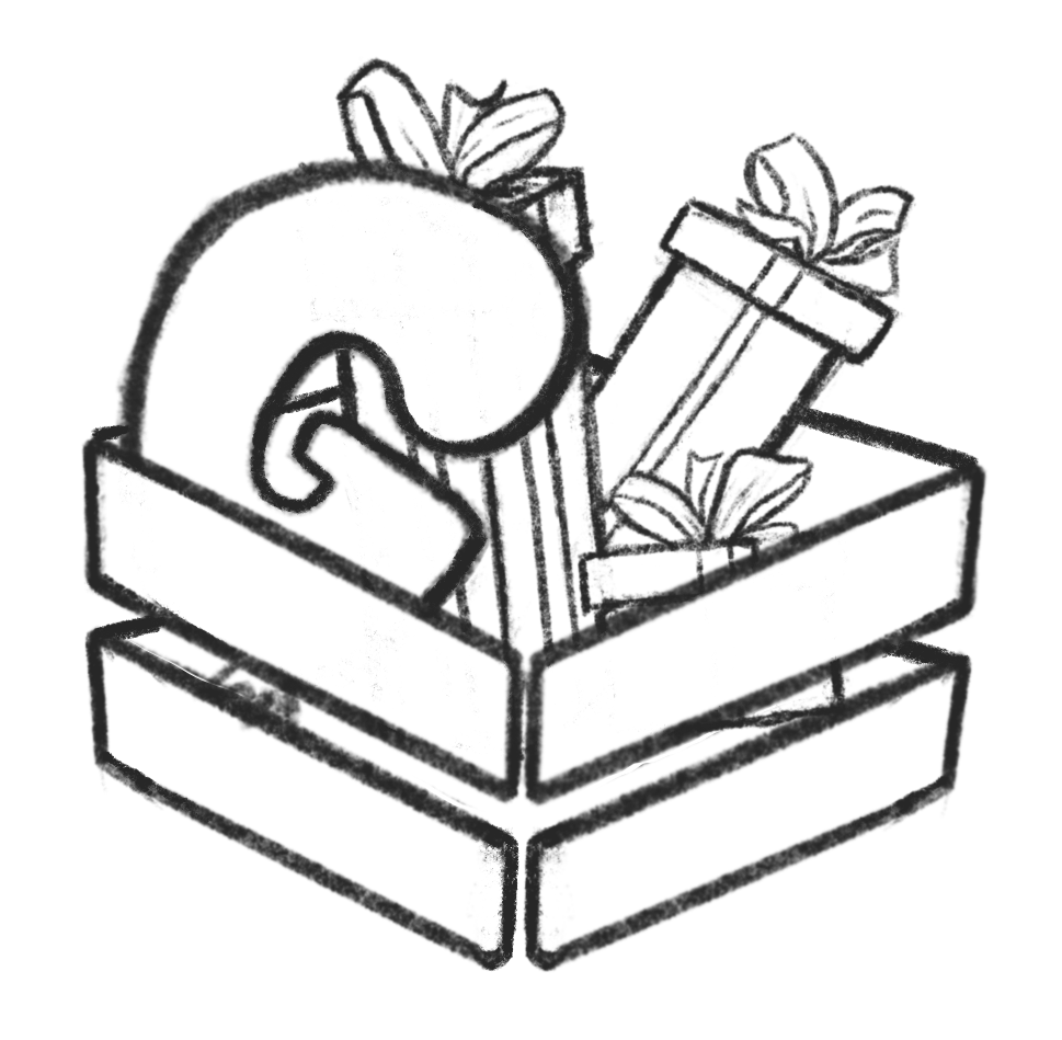

With so much creative freedom, my mind was trying a lot of things. I then dragged these and more to my computer to begging to tweak and rough out what the logos would look like.


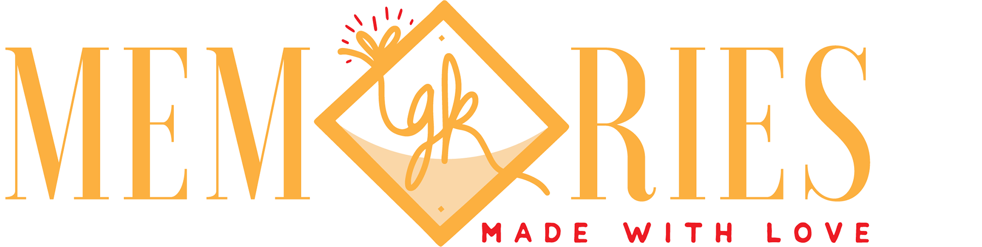
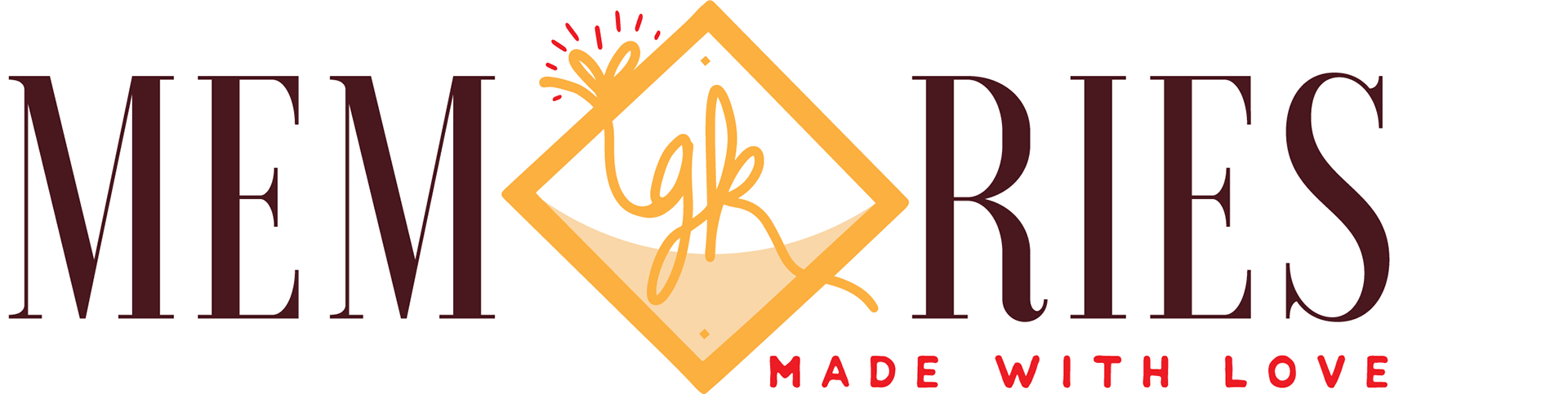


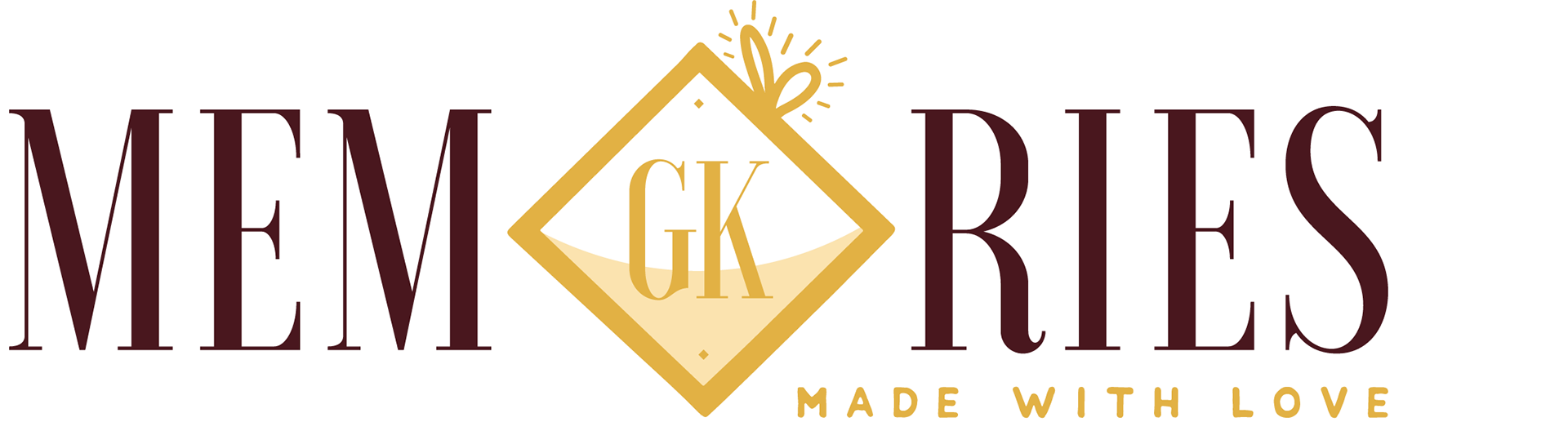
The first round of logos was not at all what my clients had in mind. They wanted a more elegant approach, but they used some of my ideas to expand on what they wanted. They liked the middlebox for an O and the incorporation of a bow to represent a gift. I took that and created some new ideas.
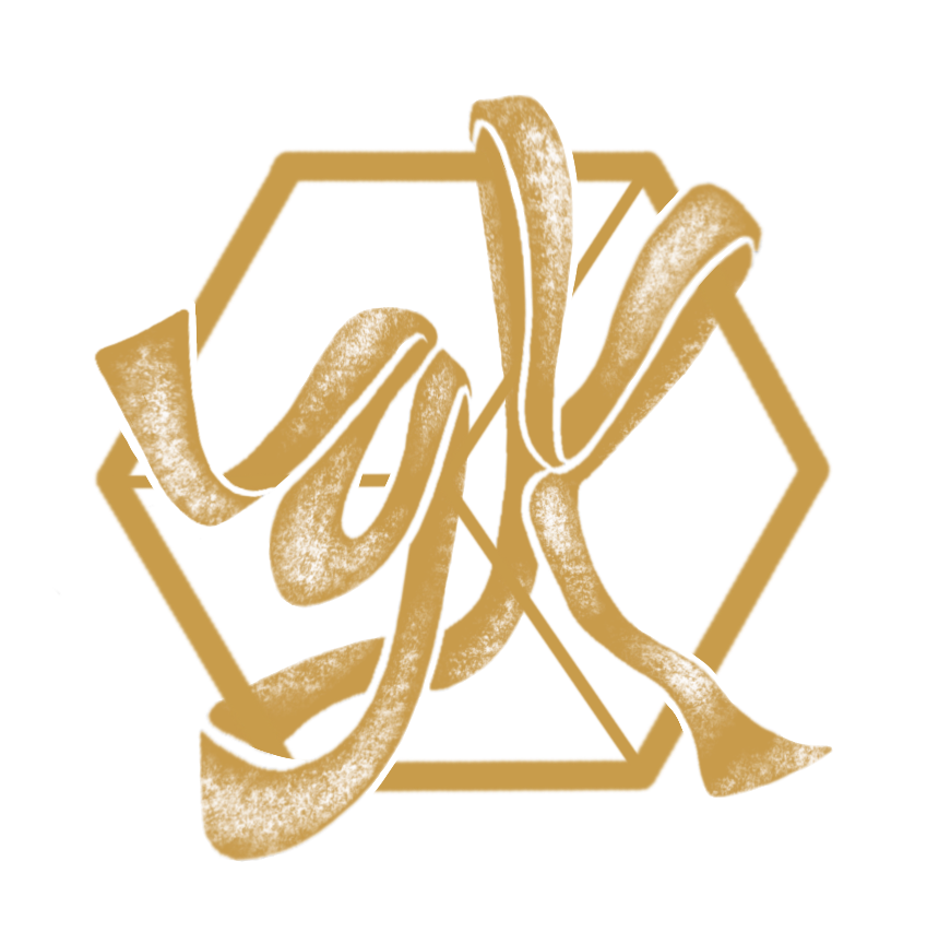
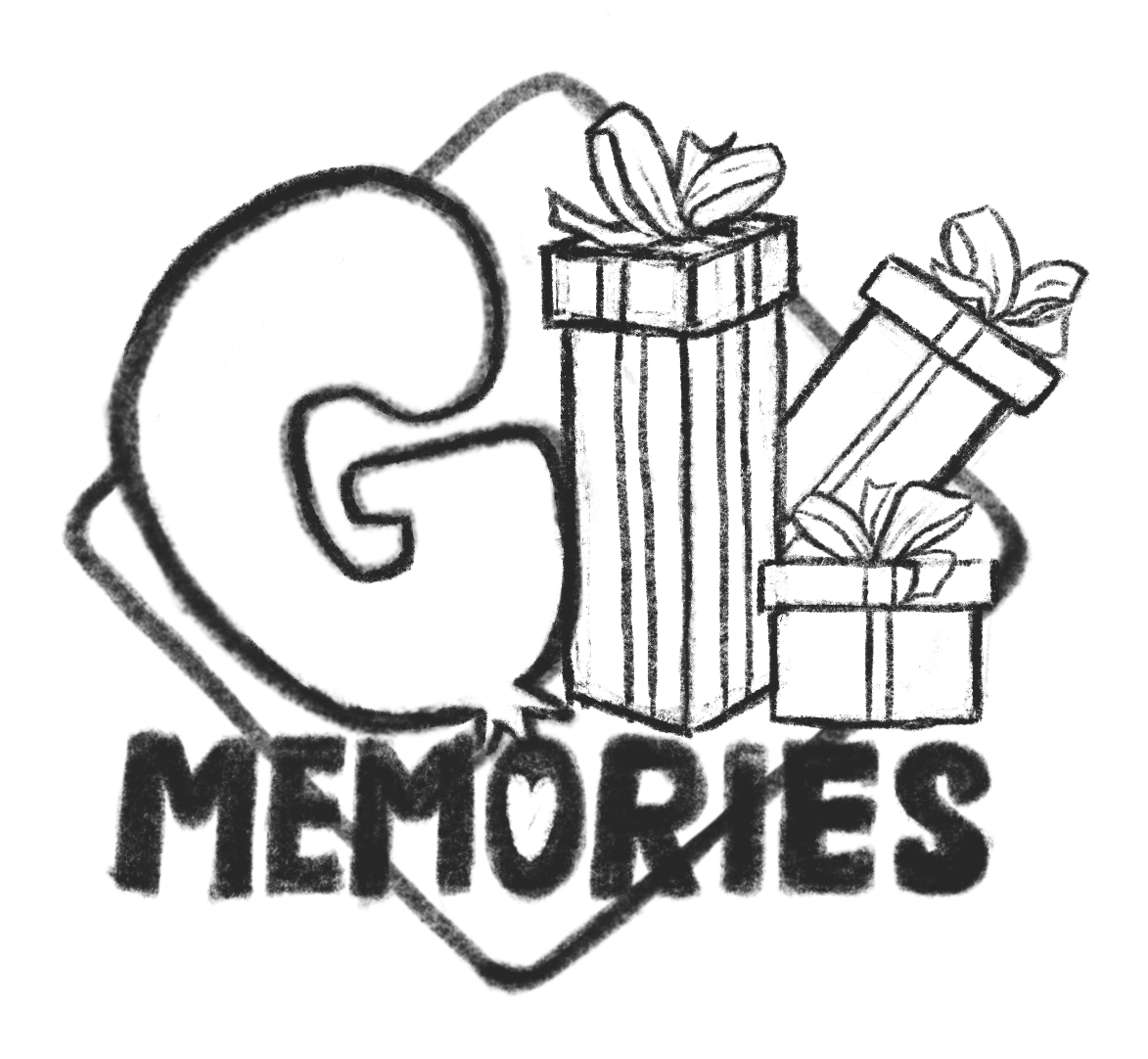
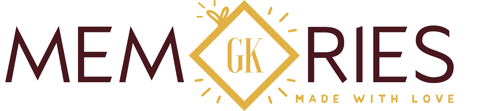
In the second round, there was a more precise focus on the design, simple, elegant, with a center gift box. I still tried different fonts and different centerpieces. The third round further pinpointed which centerpiece they liked best and the fonts they were most fond of. There the logo was chosen.
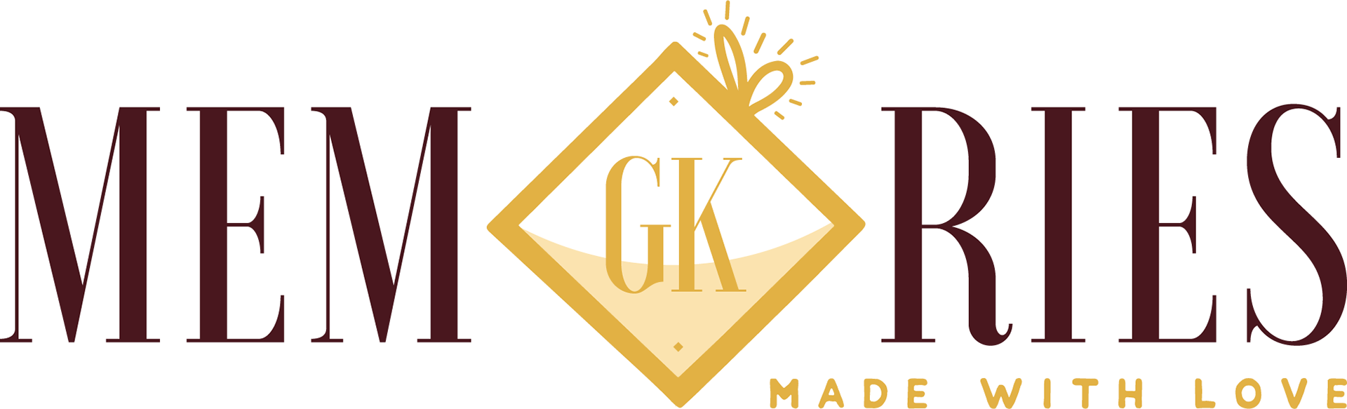
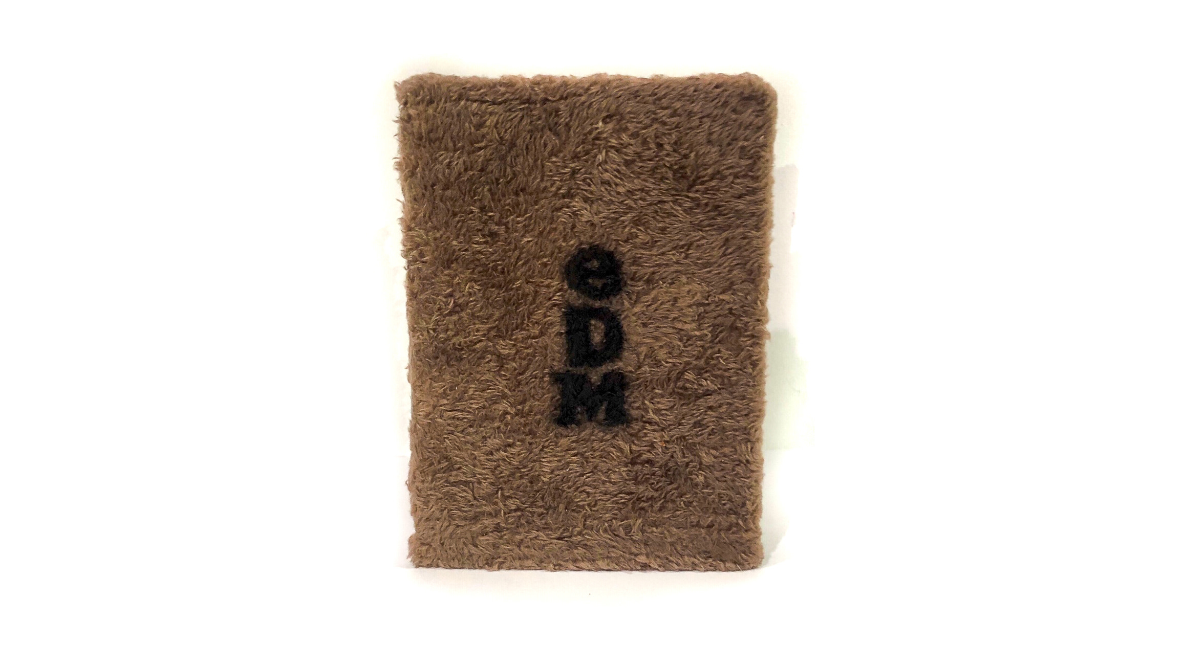
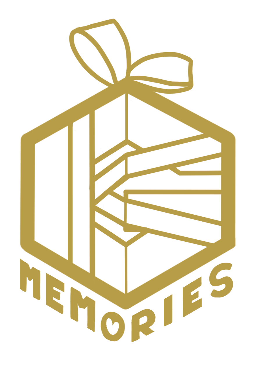
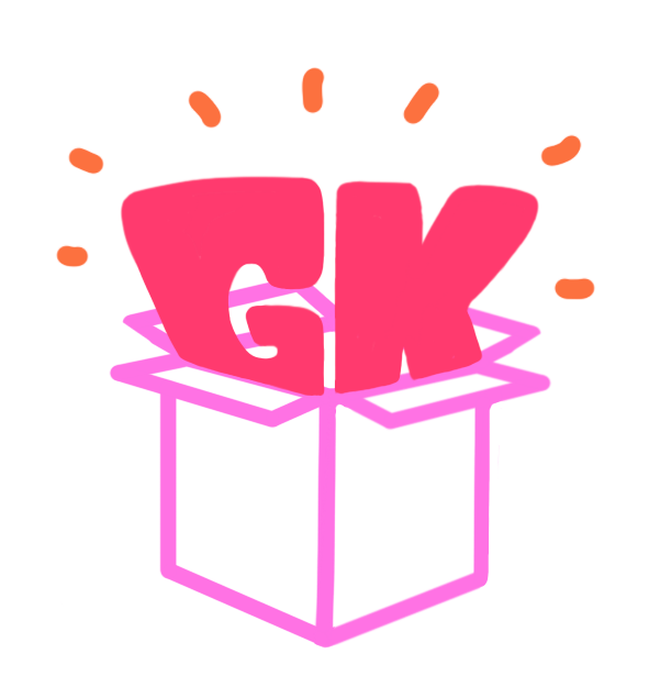
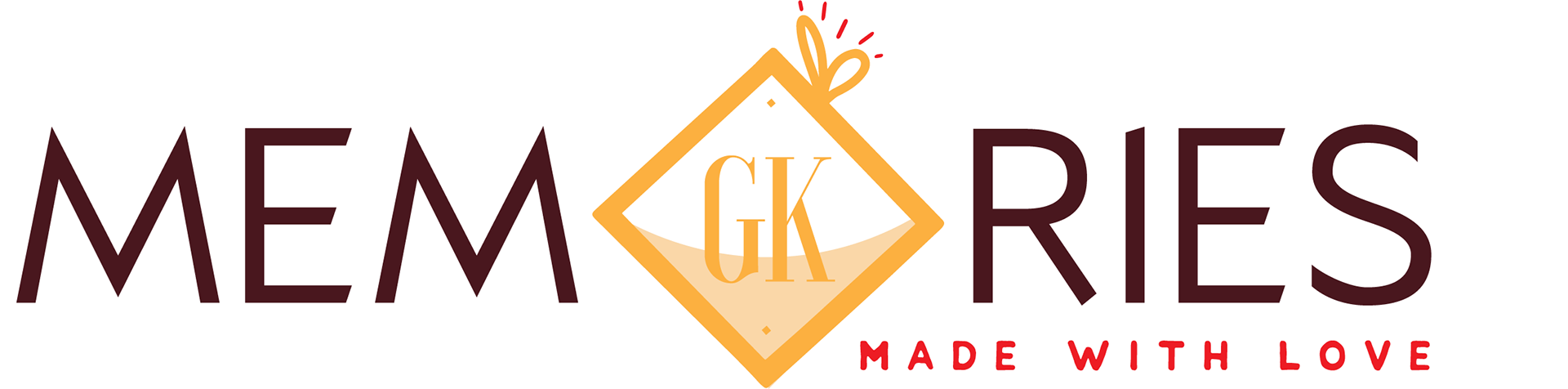
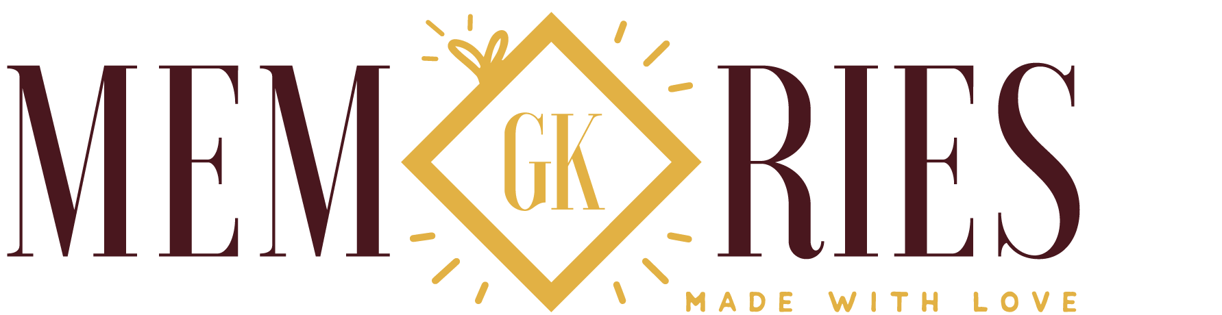
This was the logo that was chosen. The centerpiece calls back to their original logo, while the high contrast font, brown and gold colors show the elegant and sophisticated feel of their company the best.
They also wanted to promote at an event and I was hired to design their flyers and the banner for it.
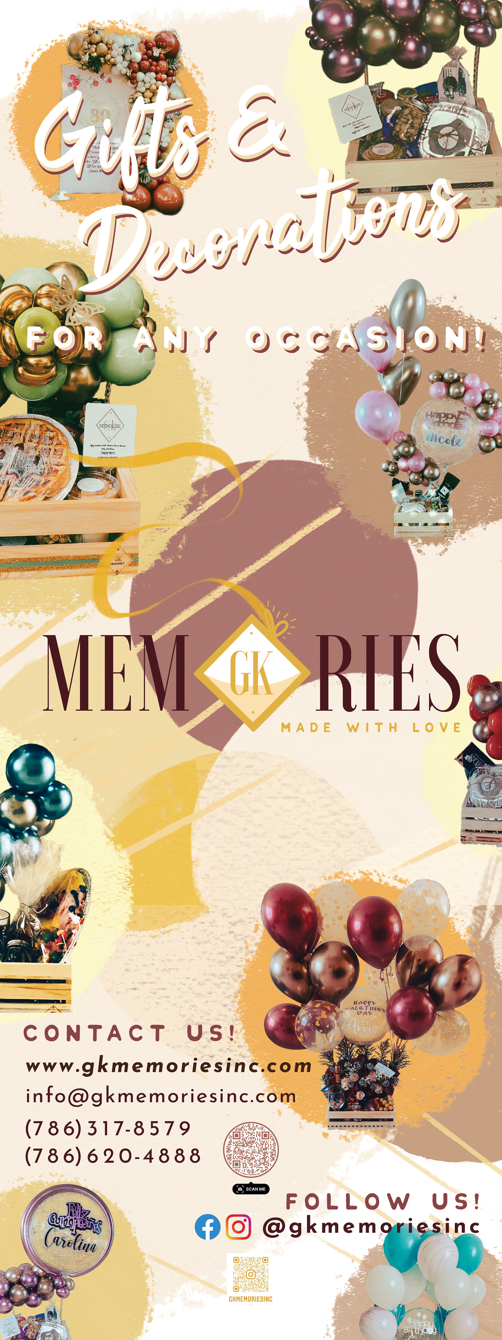

Front of Flyer in English
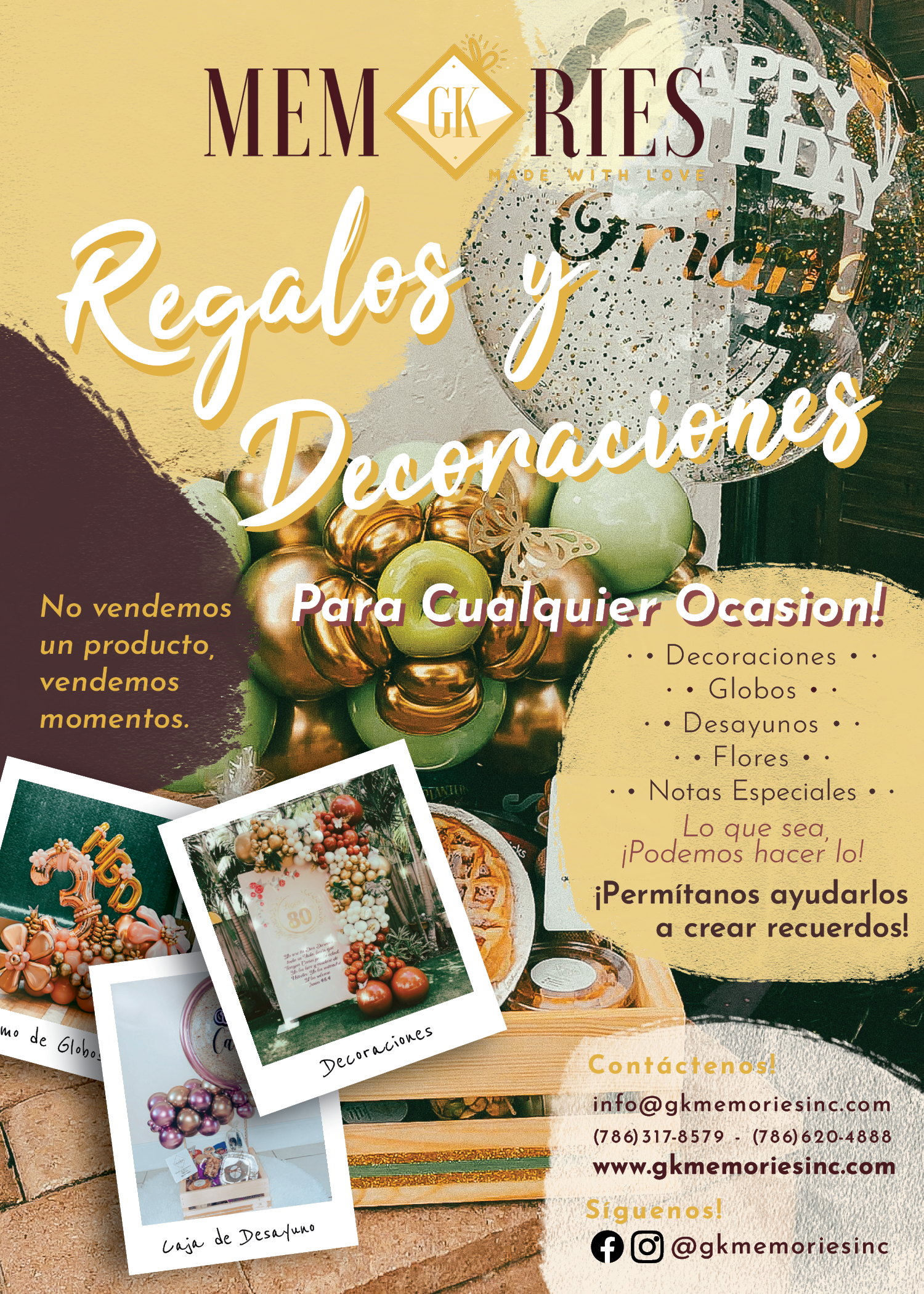
Back of Flyer in Spanish